


Cellulose, ink, art
On Printing, an eye-catching mix between art and technique, in the 2020s

First things first: thanks to everyone who made the launching of the book, Barões de Tamancos, a very special moment! The book is available here (printed) and here (ebook). If you understand Brazilian Portuguese, I also was a guest at Laboratório Carioca de Moda’s podcast, gave a short interview to Matheus Leitão at Veja Magazine, and was mentioned at PublishNews.
Offset. Linotypist. Imposition.
Newsprint, sulphite, couché, vergé.
Acid-free, with different weights.
Flashink, Toyo, and other brands.
When the book - once a manuscript, now a clean PDF after endless reviews - was ready to be printed, it felt like a new horizon had opened: wide, and with a colorful complexity that demanded several codes, be it CMYK, or Pantone tones. A rich vocabulary introduced this new perspective when the ideas will finally be available in physical support.
Ideas: how they look in our heads x how they look in a paper sheet
Now, if we tend to consider our domestic printers as somewhat temperamental objects, with sudden strikes, whims, and limitations, how would the dynamics be in a large, spacious printing company?
I must confess my memory only held two major references about large-scale printing: the wide tenacity of printing toners, in movie scenes, when newspapers were about to give game-changer news, and Balzac’s Lost Illusions, which begins by describing an old 18th-century printing company.
While Balzac himself had an unhappy adventure as a printer and editor (which made him heavily indebted in 2 years), Séchard, the book’s first character, “had been in his time a journeyman pressman, a "bear" in compositors’ slang. The continued pacing to and fro of the pressman from ink table to press, from press to ink table, no doubt suggested the nickname. The "bears", however, make matters even by calling the compositors monkeys, on account of the nimble industry displayed by those gentlemen in picking out the type from the hundred and fifty-two compartments of the cases”1.
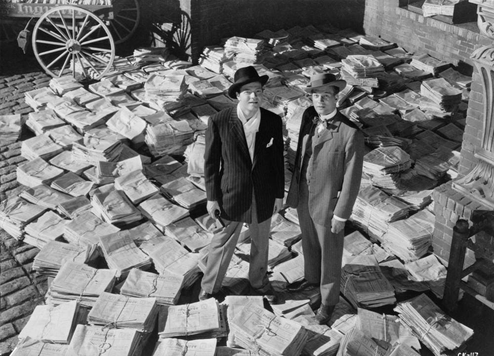
In this year of God of 2024, a printing company may not be a dark, dirty place with ink spots everywhere. On the contrary: the printing process is developed enough to provide digital alternatives. And, indeed, one of the seductions of the printing process is the very fact that we deal, at the same time, with a very traditional technology - paper - but in very modern conditions.
When we consider the progress of technologies throughout the decades, it seems natural to consider that modern choices will replace old ones or that “only the best practices will last”. We often disregard how our technological portfolio is a mix of timelines and perspectives, not because of how old or recent they are, but because we widen our choice range, we can create different artistic portfolios according to the results we want to reach.
Meanwhile, the book was printed in a digital printer, which had great results (although, second confession: I missed the effects of analogic printing in the paper, the pressure of the types over the cellulose creating a slight depth in the book page). But this incursion into a New World With Timeless Techniques was only the beginning: it was a definite step into a world of texture, smell, and challenges to hit a precise tone of a color.
Printing is also an art
By coincidence, a few weeks later, I’d find myself in a small printing fair, with a large focus on posters and independent books. One of the major techniques used by the artists was the Risograph, which has everything to do with choosing a machine and being able to speak its language until you reach the expected result.

I’d never heard about Risograph before; something between a photocopy and a printer, it is also a robust version of the same stencil principle used in silk-screen.
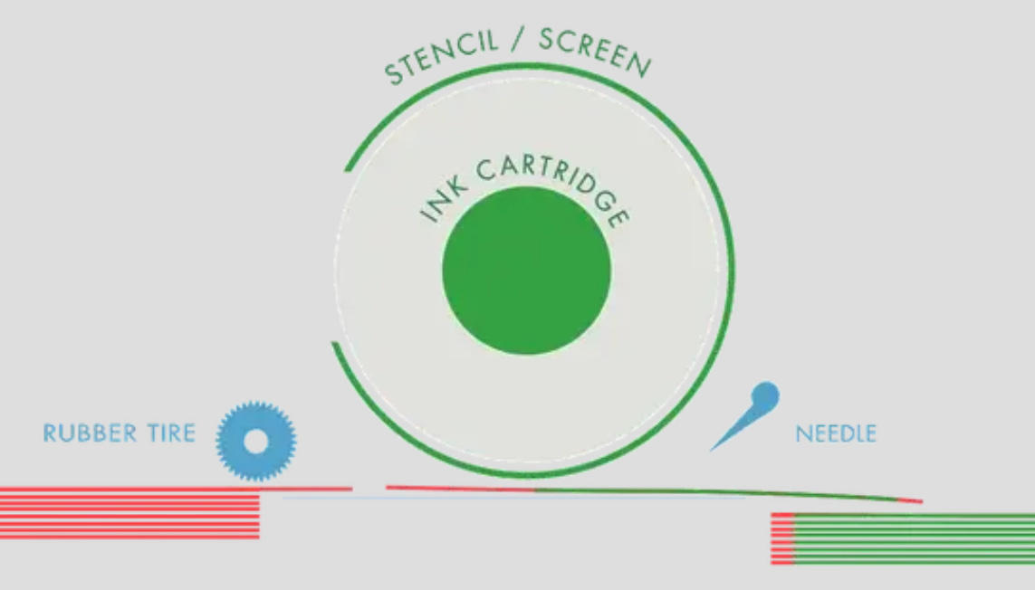
The result? Very bright colors and a bit of reticule, an occasion for uncoated papers to shine!

Between traditional wallpapers, Japanese washi, Indian ink, cellulose experts, mimeograph, risograph, and this touch of Pop Art that suits the tropics so well, I quickly realized that printing is an art per se, that goes way beyond books.

And, third and final confession, I quite like this “silk-screen approach” not only to art but to research and writing, too: selecting colors and layers, separating each one in different stencils, while idealizing a final version with lively colors. This final version is possible due to the different colored layers, of course. Hopefully, there’s always room for a new layer - be it of ideas or techniques.
P.S.: Who knows if a future edition of the newsletter doesn’t cover a traditional technique, such as Japanese papercraft? Oriental paper played an important role concerning paper quality, starting with Morning Glory stationery and notebooks back in the 2000s. I’ll leave this hint here to revisit it someday.